Rooted in the land, bottled with intention.
Client
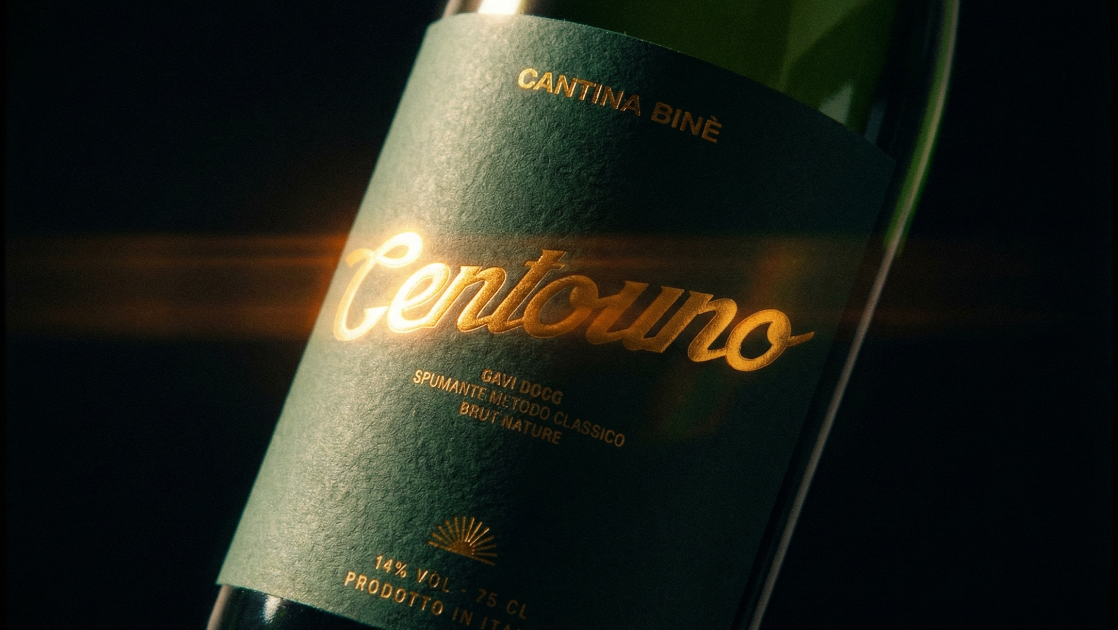
Cascina Binè is a family-run winery nestled in the hills of Novi Ligure, in the heart of the Gavi DOCG area of Piedmont. Founded by Luciano and Michelangelo Ghio, the estate spans eleven hectares of south-facing vineyards — including a distinctive circular plot planted in a radial pattern, an image so expressive it became the symbol of the winery itself. Binè is a place shaped by time: the slow time of seasons, of harvests, of a family that has chosen to grow together with its land.
Assignment
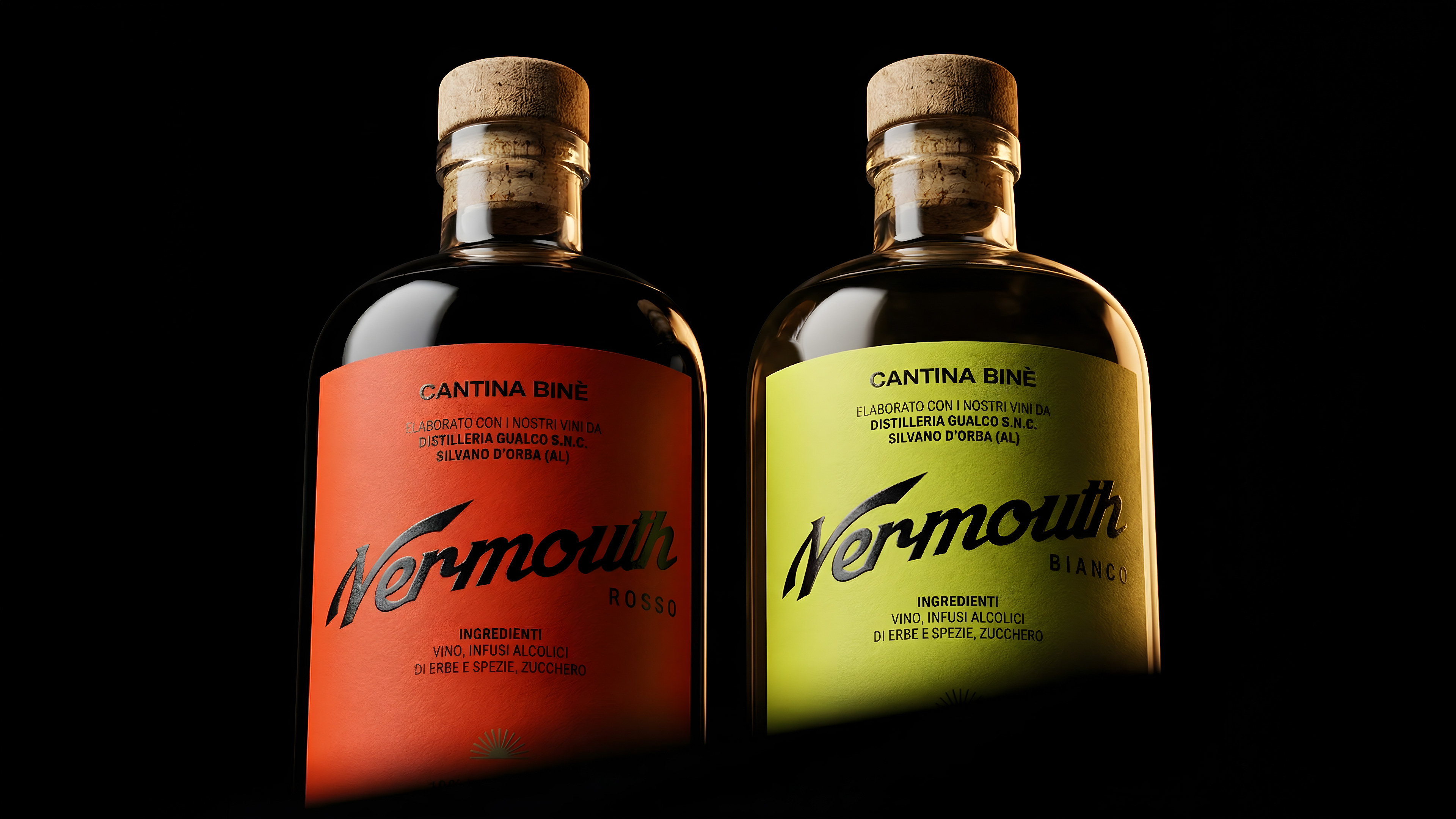
Cascina Binè was expanding beyond still wine into vermouth — a natural evolution for a winery rooted in Piedmontese tradition, where vermouth was born. The challenge was to create a label system that felt at home alongside their existing wine identity: honest, artisanal, and deeply tied to the territory, while signalling a step into something more contemporary and bold. Two expressions, two personalities — the same soul.
Solution & Process
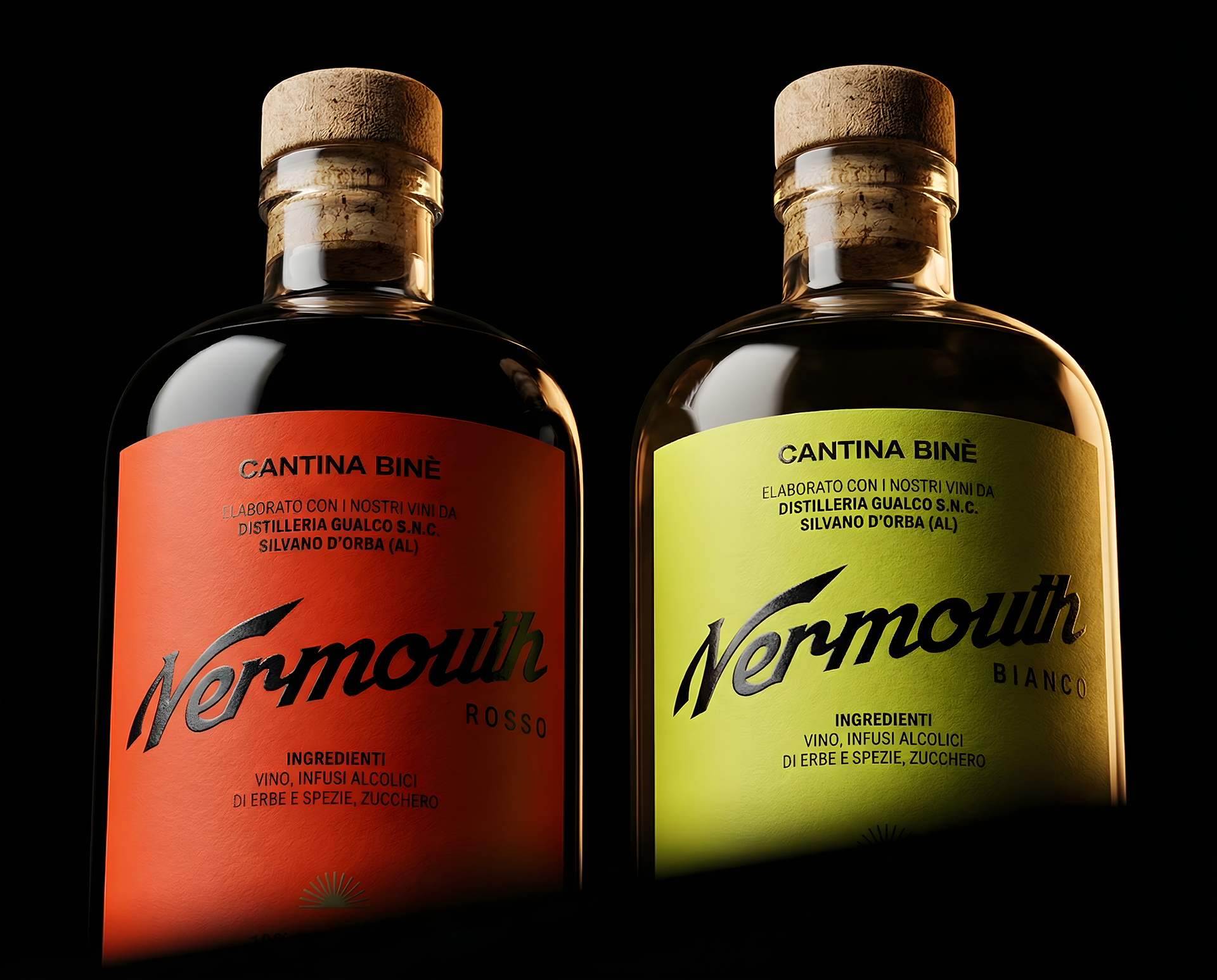
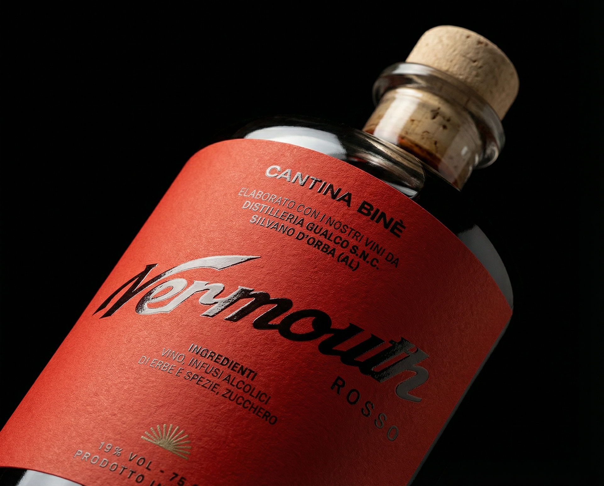
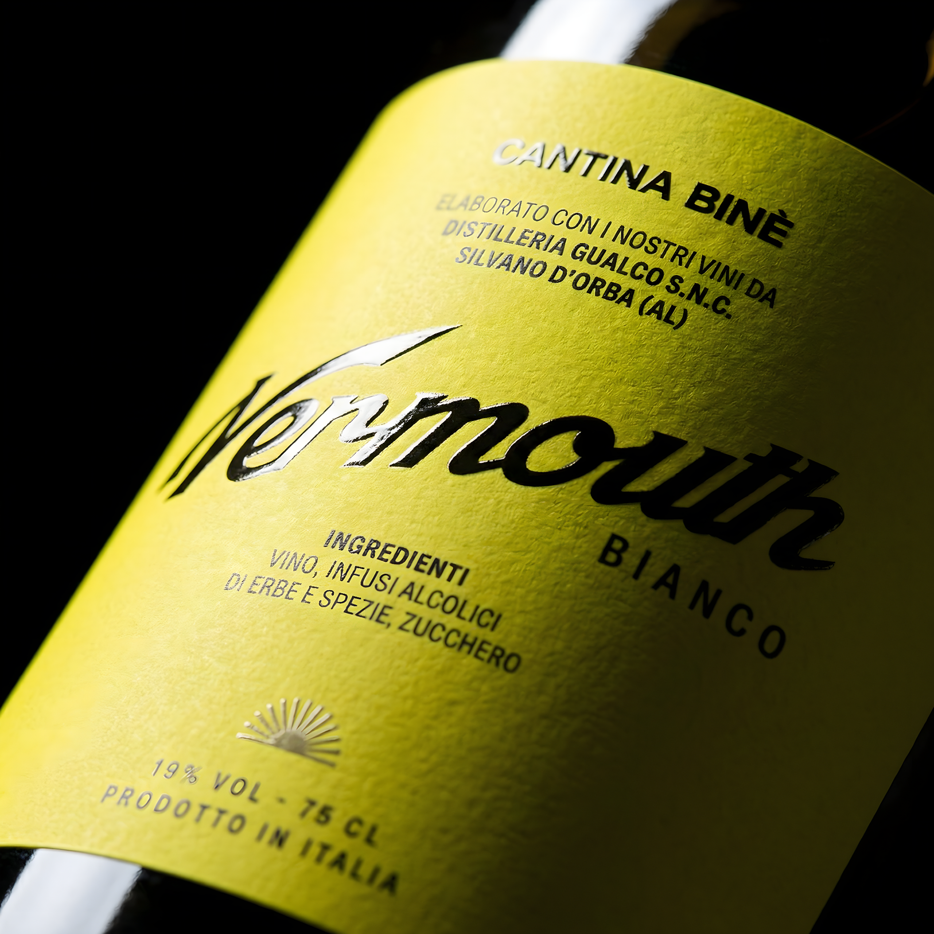
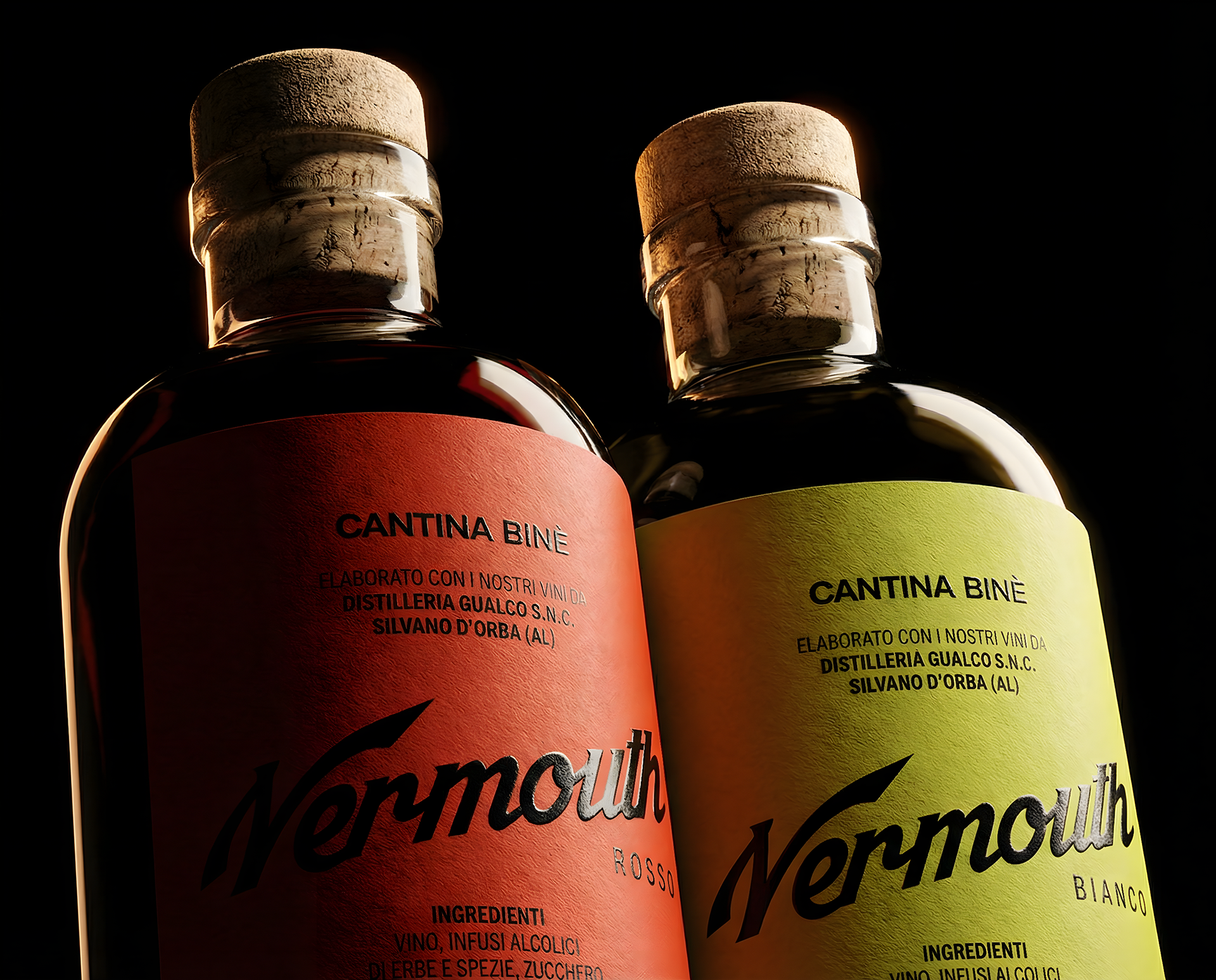
The design centres on contrast and materiality. Two colourways — a deep, warm red and a radiant golden yellow — give each vermouth expression its own character while reading as a coherent family on the shelf. Both labels are printed on Fedrigoni Splendor Gel Ultrawhite, a paper chosen not just for its exceptional brightness but for its tactile quality: the fine cold-press grain is left fully visible, grounding the label in something physical and craft-forward. The "Cascina Binè" and "Vermouth" lettering are finished in thick raised spot UV varnish, creating a relief that catches light and invites touch — a quiet but unmistakable mark of quality. The capsule on each bottle is sealed in a metallic hot-foil that precisely matches its label colour: crimson on red, warm gold on yellow. Three surface finishes — matte uncoated paper, gloss UV relief, metallic foil — unified in a single colour, creating depth without complexity. The result is a label that tells you everything before you read a word: this is a place that pays attention.
Cascina Binè is a family-run winery nestled in the hills of Novi Ligure, in the heart of the Gavi DOCG area of Piedmont. Founded by Luciano and Michelangelo Ghio, the estate spans eleven hectares of south-facing vineyards — including a distinctive circular plot planted in a radial pattern, an image so expressive it became the symbol of the winery itself. Binè is a place shaped by time: the slow time of seasons, of harvests, of a family that has chosen to grow together with its land.
Assignment
Cascina Binè was expanding beyond still wine into vermouth — a natural evolution for a winery rooted in Piedmontese tradition, where vermouth was born. The challenge was to create a label system that felt at home alongside their existing wine identity: honest, artisanal, and deeply tied to the territory, while signalling a step into something more contemporary and bold. Two expressions, two personalities — the same soul.
Solution & Process
The design centres on contrast and materiality. Two colourways — a deep, warm red and a radiant golden yellow — give each vermouth expression its own character while reading as a coherent family on the shelf. Both labels are printed on Fedrigoni Splendor Gel Ultrawhite, a paper chosen not just for its exceptional brightness but for its tactile quality: the fine cold-press grain is left fully visible, grounding the label in something physical and craft-forward. The "Cascina Binè" and "Vermouth" lettering are finished in thick raised spot UV varnish, creating a relief that catches light and invites touch — a quiet but unmistakable mark of quality. The capsule on each bottle is sealed in a metallic hot-foil that precisely matches its label colour: crimson on red, warm gold on yellow. Three surface finishes — matte uncoated paper, gloss UV relief, metallic foil — unified in a single colour, creating depth without complexity. The result is a label that tells you everything before you read a word: this is a place that pays attention.