Where do we start?
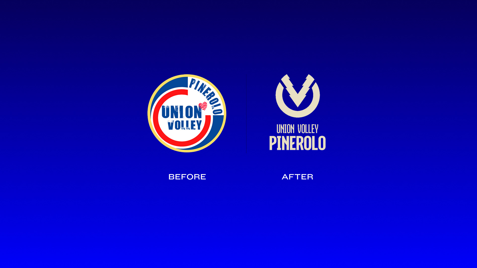
The current logo is intelligible and straightforward, but it also has some obvious limitations. It is unenforceable on digital media in smaller formats, the font is not always legible and there is no real link with the city of Pinerolo. Both the graphic choices that the typographic ones are obsolete and distant from the contemporary aesthetics of the brands and the best teams in the sports industry
The Rationale
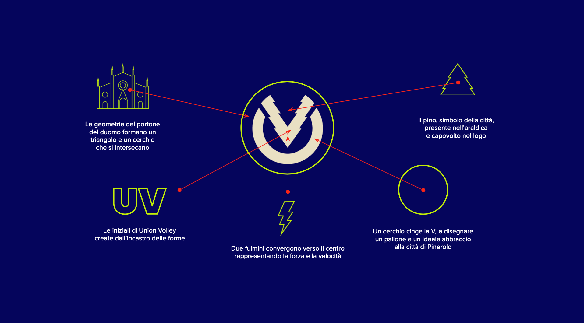
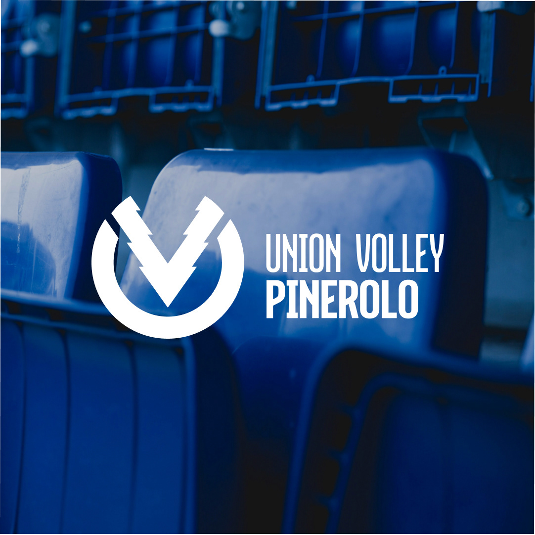
The new logo was born from the union of several icons of the city and from the idea of creating a symbol that represents the sense of belonging to the team and to the city of Pinerolo; a contemporary, minimalist, bold logo, following the example of the biggest sports team brands in the world.
The Solution
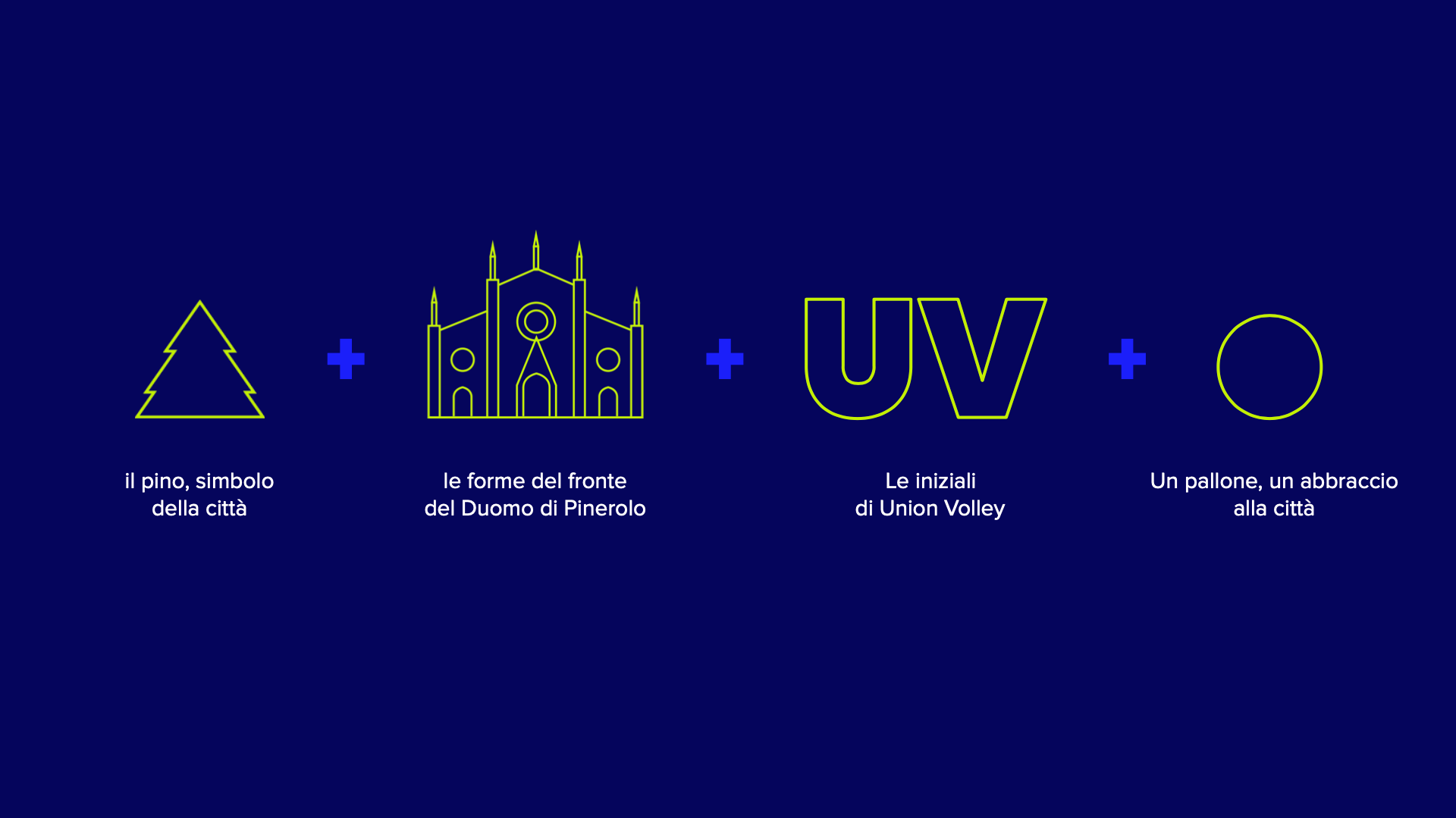
The U and the V come together in an ideal embrace of the city of Pinerolo. The two shapes take up the geometries of the cathedral door, a V that crosses the circular shape of a volleyball, creating a U. A pine tree, present in the heraldry and original element of the name of the city, intersects in the V, creating a negative space which, with the other shapes, inspires the suggestion of two lightning bolts converging towards the centre, to symbolize strength and speed.